How To Yield An Ember Component In Multiple Places

Those who have worked in Ember for a while know how powerful Components can be. If you aren’t super familiar with the ins and outs of Components, you should check out the guides or this video breaking them down in detail. However, there is one thing that isn’t straightforward when dealing with block components:
How can I yield elements in two different locations?
What Exactly is the Problem?
First off, let me qualify this by saying that there are a ton of different ways to solve this problem, so if you have a different solution, that’s great. This is just the one I found the most straightforward.
For a normal component, your template may look this:
<section class="your-content">
  <div class="your-content__inner">
    {{yield}}
    <button {{action "someAction"}}>Click!</button>
  </div>
</section>
It gives us a section with a preset class, a button with an action that lives on the components JavaScript file, and then gives us a yield where users can put any content they want. They would use it like this:
{{#cool-component}}
<p class="your-content__text">Hi there!</p>
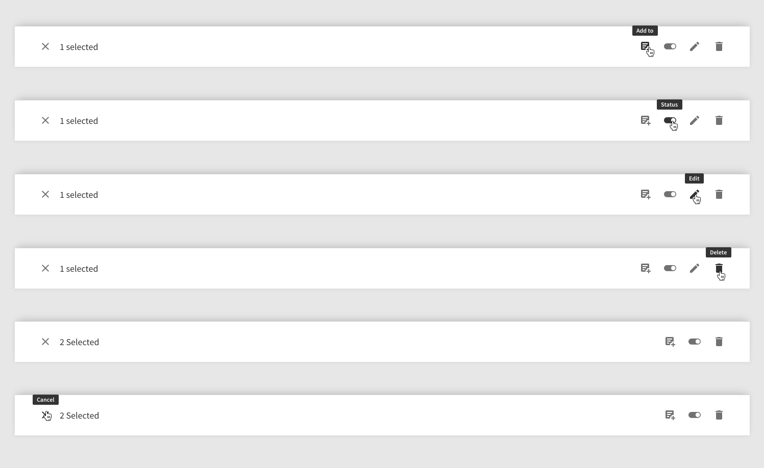
{{/cool-component}}Your p tag with “Hi there!” shows up in the yield block. Pretty straightforward. However, it becomes tricky when you want to have multiple yield blocks in your component. As a simple example, we have an internal add-on we use for multiple apps to get consistent styling across some commonly used elements. In this case, we were creating a toolbar:
Let’s keep it simple for now. This is what your ideal component would look like:
<div class="toolbar__context">
  {{close-icon close=(action "close")}} {{!-- just an svg --}}
  {{yield}} {{!-- custom text i.e. "1 selected" --}}
</div>

<div class="toolbar__actions">
  {{yield}}  {{!-- buttons/action items go here --}}
</div>
It is a consistent toolbar but every app will have different needs as to what goes in it. Some will have text, like “1 selected,” or information about the action item. Some will have multiple buttons on the right, some will use icons, some will have a dropdown, etc. The toolbar itself has styling and logic that is reused but the content in those two sections will be different in each application. However, if you try to add content, both yield blocks will show it.
How Do We Control Where Our Content Shows Up?
This is where contextual components come in handy. Here is the example from the Ember guides.
Blog-post component:
<h2>{{title}}</h2>
<div class="body">{{yield (hash body=(component editStyle))}}</div>
Which can be used like this:
{{#blog-post editStyle="markdown-style" postData=myText as |post|}}
  <p class="author">by {{author}}</p>
  {{post.body}}
{{/blog-post}}
There’s a lot going on here. We are using the hash helper to yield another component. This component is dynamic and loaded based on what you pass to editStyle. This means that you have to have a component called markdown-style in your app. However, our problem is that we want to allow each app to put whatever they want in these blocks.
Generate a Blank Component
To get around this, we created a “blank” component, which in itself has a yield block. It looks something like this after running ember g component blank-template:
import Component from '@ember/component';

export default Component.extend({
  tagName: ''
});
In the component file, we specify tagName is empty because we don’t want to add anything to our DOM we don’t want. By default, a component wraps everything in a div but this little trick gets around that although it has a few catches, so only use it if you are absolutely sure. If you are using Template-only Glimmer Components, however, you can skip this step entirely.
Our template then looks really simple:
{{yield}}That’s it. This blank component does nothing but yield what we give it. So, how does this help us with our toolbar? Well, now we can do this:
<div class="toolbar__context">
  {{close-icon}}
  {{yield (hash context="(component blank-template"))}}
</div>

<div class="toolbar__actions">
  {{yield (hash actions=(component "blank-template"))}}
</div>
We use the hash helper again but rather than selecting a dynamic component, we point it right to blank-template (and no, you don’t need to specify component). We give each yield’s hash its own name. The first is context, which is where we expect users to put a description of the toolbar (if they want it) and actions is where we expect them to put buttons. They would use it like this:
{{#fancy-toolbar as |toolbar|}}
  {{#toolbar.context}}
    <p class="toolbar__context__text">Hi there</p>
  {{/toolbar.context}}

  {{#toolbar.actions}}
    <button class="button-filled toolbar__action">Click me</button>
  {{/toolbar.actions}}
{{/fancy-toolbar}}
By doing {{#fancy-toolbar as |toolbar|}} we can access toolbar.context and toolbar.actions right in our template. And since we are using our blank-template, we don’t have to worry about it adding any extra markup to our page. We can also reuse blank-template in all our components where we do something similar.
If you want to see an example of this toolbar, you can check out this twiddle that shows a toolbar in action (although it isn’t styled as well as the one in our apps). Feel free to play around with that pattern.
Originally published by Scott Batson on DockYard's Blog.